Zavvi Gallery is home to prints and posters from the best designers and illustrators in the business, becoming a part of the growing alternative movie poster scene.
Popular franchises it has featured includes Star Wars, Stranger Things and Predator, as well as Alien.
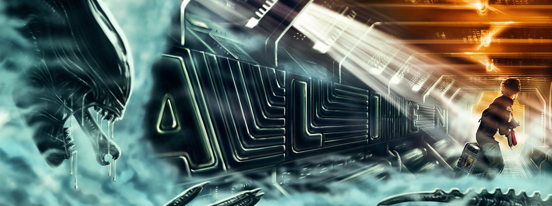
Illustrator Sam Gilbey's print to celebrate the iconic film's 40th anniversary is the latest to join the Zavvi Gallery. We spoke to him to learn more about the inspiration behind it, and the design process.
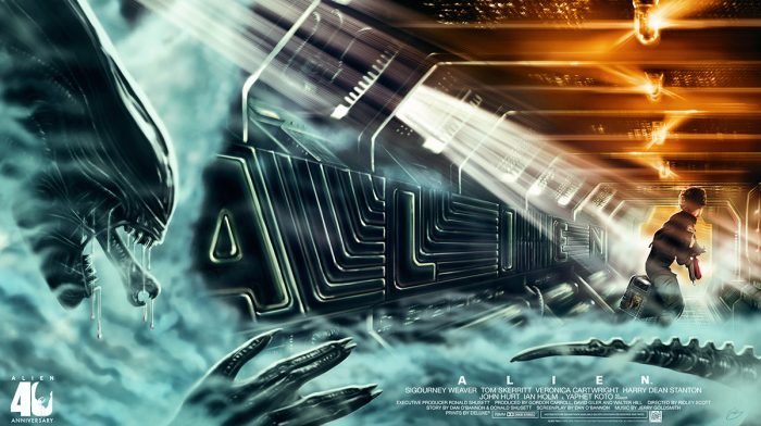
I first saw Alien as a teenager, I can’t remember when exactly, but once you see it, it feels like one of those films you’ve known forever. I absolutely loved it, despite, or maybe because of my fear. The sense of suspense, the production design, the pacing, the music, the characters and perhaps most crucially, the relationships between them. It’s just one of those perfect classics.
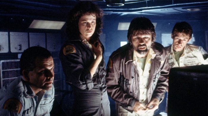
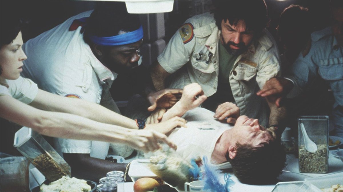
There are so many amazing scenes, but I think my favourite is the moment when they first discover the ship. For want of a better word, it’s just so ‘alien’. And then you’re going between the natural view of it, and the interlaced images on Ash’s screen. The atmosphere of that scene, of crossing that threshold, just sets everything else up so brilliantly, in terms of the inevitable cascade into chaos.
This is a film that’s been tackled so many times, so I thought a lot about what I would like to bring to it. In the end I wanted to distil it down to what I saw as the most important elements; the xenomorph, Ellen Ripley, and the claustrophobia you get from the dimly lit corridors. I then had the idea of using the softer panels in the corridors as the basis for the title, and by that point the whole image was distilled in my head, and I made this sketch. In that way it’s a bit of a companion piece to my Die Hard print from last year, in terms of it being set in a dimly lit narrow space, but also where on that one the title was done as if stencilled on the wall.
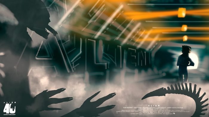
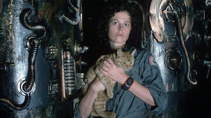
Once I had that sketch, even though that contained all the elements I wanted, and crucially the right atmosphere and colour, it then took three to four months to complete the poster. Admittedly on and off, but it took a really long time to get all the details right, and bring it to life whilst staying true to the original concept. I also had to figure out how to make it correct in terms of the narrative of the film. In the end I settled on the section where she sets the self-destruct, and is actually coming back towards us to the escape pod, but wheeling around looking behind her thinking she might be getting chased. In a moment she gets a glimpse of the alien, puts Jonesy down and then heads back to try and cancel the self-destruct, only to realise that she can’t.
This was a case where not much changed during the process, although early on I was thinking that maybe the Alien should only be a shadow cast on the steam. I do love how Ridley Scott shows the creature so sparingly, which, like Jaws, is what makes it all the more terrifying. I experimented with that smoke shadow idea for a while, but quickly realised that I wanted to paint the xenomorph in all its terrifying shiny glory, showing it through the steam, and having it glinting in the light just enough.
The print will only be live until 6pm Monday 9th September, so hurry and secure yours today.
For all things pop culture and the latest news, follow us on Instagram, Twitter, Facebook and TikTok.

